Diagnosing the ills of Apple Watch through the lens of Clayton Christensen’s jobs-to-be-done framework, and prescribing a new path forward that can truly make a dent in the universe.
Those who’ve read my generalist’s review of Apple Watch will know that I was an early adopter of the platform. Though I had long ago given up wearing a wristwatch, I was intrigued by wearable technologies in general and the potential for Apple Watch in particular, so I pre-ordered a Watch in April of 2015 and, upon receipt of my 42 mm model with the stainless steel case, I wore it all but daily for the next year-and-a-half.
As noted in my review, which was written after four months with the device, there were a few things I really liked about Apple Watch and a few things I strongly disliked. On balance, I wasn’t fully won over, but I decided to soldier on with it, partly in the hope that future software updates would address my issues and partly in the expectation that the Watch would simply grow on me. After all, it had been years since I’d worn a watch of any kind, so it seemed reasonable to expect that it would take some time to re-acclimate to strapping a gadget onto my wrist every morning.
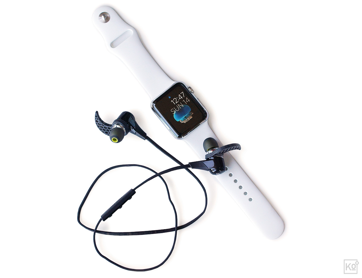
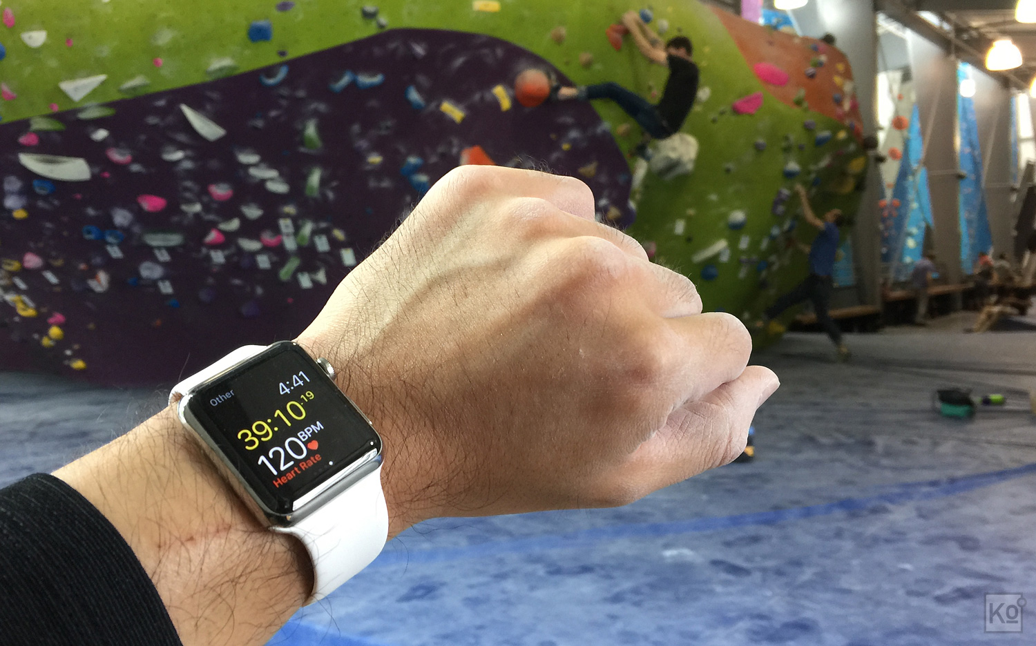
Here’s a look at my first generation 42 mm Apple Watch in stainless steel with a white fluoroelastomer band (note that the Bluetooth headphones were not included with the Watch). This combination retailed for $599 USD when it launched in April of 2015, but the price of this configuration was dropped to $549 with the launch of Apple Watch Series 2.
Months stretched into over a year with the Watch and, over that span, instead of warming to it, my feelings only grew cooler. For starters, Apple failed to release any meaningful improvements to its user experience: I dutifully upgraded my Watch with each “major” software update, but found that they only nibbled at the edges of the device’s fundamental shortcomings. It remained cumbersome to use, compelling apps remained MIA and I hated having yet another device to charge every night.
What surprised me, though, was that as grating as those issues were, the one that came to dominate my personal list of Apple Watch gripes was its aesthetic. The reason for my surprise was that I’ve never been a jewelry guy: For years, the only ornament I’d worn was my wedding ring and, back in the olden days when I did wear a watch, I invariably gravitated to the most basic, utilitarian styles. On top of all that, I’ve long been a fan of Apple’s spare, Bauhaus-inspired industrial design aesthetic. So if anyone were to like the look of Apple Watch—which is essentially an iPhone in miniature—it should have been me. And yet, as noted in my review, I felt that even my $599 stainless steel model “lacked a sense of occasion,” and I just couldn’t connect with it as a fashion statement, which is precisely the sort of thing I never envisioned myself saying.
It’s worth noting, too, that this lack of connection wasn’t for lack of effort or investment. Finding the Watch’s included fluoroelastomer band good for fitness but lacking in expression, I took advantage of the device’s fantastically well engineered mechanism for changing straps and, over time, purchased Apple’s Milanese Loop, Woven Nylon and Classic Buckle bands. Including the Watch itself, that meant I had spent over $900 in an effort to create a version of the device that I genuinely wanted to wear rather than a device that I felt obliged to wear.
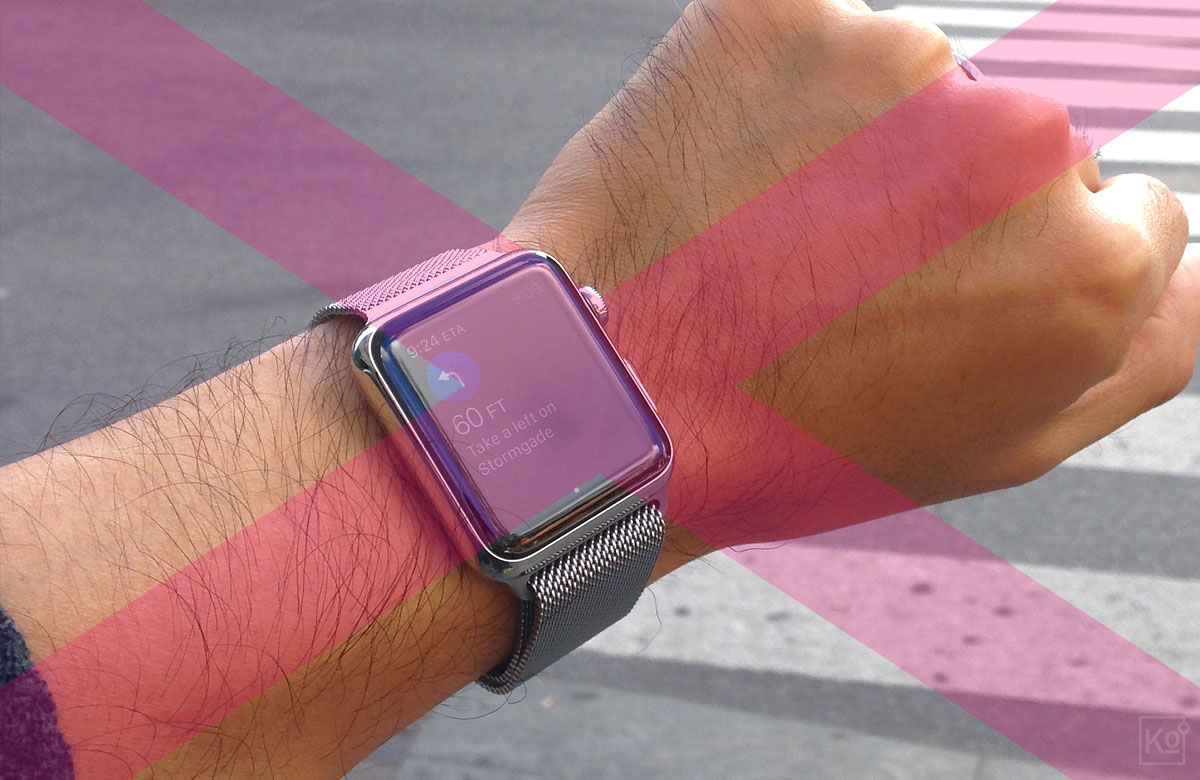
Of the various straps I purchased to customize my Watch, Apple’s “Classic Buckle” in saddle brown came the closest to winning me over. The quality of Apple’s straps and bracelets is beyond reproach, and the mechanism Apple developed to enable quick strap changes is fantastic. Unfortunately, Apple’s non-standard lugs and the need to keep the back of the Watch unobstructed to retain line-of-sight for the device’s optical heart rate sensor significantly limits strap options. As many a watch enthusiast will tell you, you’d be amazed at the difference a new strap can make, and changing out straps, bands and bracelets is half the fun. In its attempt to fulfill the role of a watch, Apple Watch definitely falls short on this criteria. (Image credit: Apple, Inc.)
As you might have guessed by now, I never quite got there. The saddle brown “Classic Buckle” almost had me convinced—its supple leather, fine stitching and high-polish stainless steel lugs (the part of the strap that attaches to the case) brought some much needed warmth and allure to the Watch. But its net effect on my soul was more smoldering campfire than raging inferno. By this point, I’d already stopped using my Watch to track workouts and occasionally left the house with a bare wrist. While I didn’t love my Apple Watch, I did find that, on those days without it, I missed its presence. This left me at a crossroads, which is where I might still be were it not for a fateful detour while shopping for Christmas gifts late last year.
Love at First Sight
By pure happenstance, I found myself at a Shinola store in downtown Portland on a cold and gloomy Saturday in November. I was only vaguely aware of the Shinola brand at that point and had no idea that they operated a retail store in Portland. Initially, I thought it was the sort of shop that’s fairly common here: a boutique featuring an eclectic mix of crafts and jewelry made by homegrown artisans. But, as I looked more closely at the goods on offer, it struck me that they exhibited a level of industrial design well beyond the norm for local boutiques. And then I came upon their watches...
It was one watch in particular, a model called the Runwell Chrono, that caught my eye. The ardor I had hoped I could kindle for my Apple Watch through the addition of straps and customized watch faces hit me the instant I saw the Runwell. At a retail price of $750, it was a fair bit more expensive than the starting price of my stainless steel Apple Watch; and, as an analog watch, its feature-set was infinitely more limited. So my desire for the Runwell Chrono didn’t make a whole lot of logical sense, yet I wanted it intensely and, after thinking it over for a day, I went ahead and bought one.
Here’s the watch I fell in love with at first sight on a fateful night in November: The 41 mm Shinola Runwell Chrono with a cool grey dial and brushed stainless steel case. The Apple Watch feature I used most frequently was its countdown timer to time the steeping of my morning cup of tea and my afternoon cup of joe (brewed via a French press). As someone who knew nothing about watches at the time, I never even considered that an analog timepiece could fill that role without forcing me to perform mental gymnastics until I encountered the beautiful Runwell Chrono. I should note that the watch is shown here on a killer aftermarket NATO strap from a company called ToxicNATOs—at just $18 USD, it was an incredibly cost effective way to personalize the watch to suit my style.
The day I picked up my Runwell Chrono is the last day I wore my Apple Watch. True to my OCD inclinations, I’ve since purchased three more analog watches, and a highlight of my mornings now is deciding which I’ll don for the day. That feeling of an “obligation to wear” that I mentioned earlier in connection with my Apple Watch is history, replaced by an eagerness to wear and use my quartet of beautiful little time machines. And it’s worth mentioning that this change in perspective is not a function of price: Of my analog watches, all but the Shinola cost considerably less than my Apple Watch. So, what’s going on here? Why would a self-professed geek and longtime fan of Apple’s design aesthetic eschew the future and instead embrace the now anachronistic “dumb” watch? I have a theory.
Understanding the Job to Be Done
Longtime readers of this site will know that I’m a big fan of Clayton Christensen’s “job to be done” approach to product creation. For those unfamiliar with this, Christensen is a Harvard Business School professor and longtime business consultant who’s perhaps best known for his book The Innovator’s Dilemma, which was published in the late-90s and introduced a generation of soon-to-be dotcom entrepreneurs to the theory of disruptive innovation. There’s been some debate in recent years as to the validity of this theory, but it’s proven its utility to me and his book remains the one and only business tome on my bookshelf.
Now, that being said, while I do periodically return to The Innovator’s Dilemma to help provoke big-picture thinking, I find myself referencing Christensen’s jobs-to-be-done product creation ethos with much greater frequency. I could make a feeble attempt at explaining it, but better to let the man himself talk you through it:
In short, McDonald’s assumed that customers were primarily buying milkshakes for their flavor and nutrition—seemingly safe assumptions—but efforts to boost sales through improvements to these attributes had little impact. So McDonald’s brought Christensen and his team in to help and, through on-the-ground observation and one-on-one interviews, they came to understand that fully half of all milkshake buyers primarily purchased the product to keep them occupied and interested during their morning commutes to work. According to these customers, the leading requirements for this job included easy consumption with one hand; an item that would take about as long as their commute to fully consume; and staying power, meaning that it should keep them full past 10am. Flavor mattered, but it was table stakes—helping car commuters stave off boredom was where the opportunity for differentiation and growth lay.
By re-formulating their milkshakes to deliver on the actual job that customers were hiring the product to do—for example, by incorporating chunks of fruit into their milkshakes, not to make them healthier, but to make them more unpredictable and interesting to consume—Christensen claims that McDonald’s saw a 4x increase in sales. Another critical insight that Christensen’s team brought to light was that the market opportunity for milkshakes was far larger than McDonald’s had previously recognized. Their competitive set was not milkshakes from Burger King or Wendy’s, it was the universe of breakfast items that could be consumed on-the-go—from bagels to bananas—meaning that the potential return from investing in innovation against milkshakes was significantly greater than McDonald’s had anticipated.
So, what does all this have to do with Apple Watch? Well, I had assumed that my creeping disaffection for the device was simply down to my personal preferences in fashion and function. But in the months following my review, I noticed an increasing volume of tweets and blog posts expressing sentiments regarding the Watch that were strikingly similar to my own (this was particularly true in February of 2016, as people who received Apple Watch as a holiday gift realized that they didn’t particularly like it). This suggested that the issue went beyond a simple matter of individual taste, which encouraged me to re-examine my experience with Apple Watch through the lens of Christensen’s jobs-to-be-done ethos.
A Rose by Any Other Name
As the name and form of the device suggest, the folks in Cupertino believed Apple Watch would subsume the role of a wristwatch—a seemingly safe assumption given that Apple Watch would have to gentrify the same physical real-estate on the body. But I believe that, in this core assumption, Apple has made the same mistake that McDonald’s initially made in assuming that their competition was other milkshakes. If you compare the reasons people hire a wristwatch to the aspects of Apple Watch that proponents value, it becomes clear that these are two very different jobs with two very different sets of qualifications.
Let’s start with the conventional watch: Why do people hire a wristwatch today? This snippet from a New York Times Magazine article published in June of 2015 and titled Can the Swiss Watchmaker Survive the Digital Age? eloquently summarizes the consensus view:
These days, nobody needs a watch to know the time. Time is all around us, displayed on every computer, phone and microwave oven. The Swiss watchmakers realize this. They market their mechanical watches as not only accurate but also deeply symbolic. For those willing to spend $30,000, a traditional Swiss watch marks its owner as a man or woman who appreciates quality, artistry and ingenuity (and, of course, as a wealthy and conspicuous consumer). Wearing a mechanical watch today makes an explicitly antidigital statement, embracing the long pedigree of a device that predates not only computers but electricity itself. It tells the time but is timeless. “A mechanical watch,” Jean-Claude Biver, the chief executive of TAG Heuer, said, “is a piece of eternity in a box.”
This is something of a tangent, but I feel compelled to comment on Jean-Claude Biver’s quote at the end of that snippet—it might sound like a whole lot of hot air, but these notions of timelessness and “eternity in a box” have deeply resonated with me. We live in an age in which our machines penalize us for use: The battery life indicator on our phones shrinks with each glance at the status bar and, whether you drive an internal combustion or electric car, each press of the accelerator diminishes your range.
A self-winding “automatic” watch, on the other hand, is singular amongst machines in that it rewards use by charging itself with each movement of your arm—no batteries required. I’ve found this symbiosis of man and machine, and the idea that, in theory at least, an automatic will run forever so long as I keep wearing it, both poignant and liberating. Which explains why my auto-winding watches get a lot more wrist-time these days than my quartz-based Shinola—the watch I fell for at first sight that, unfortunately, requires a battery (to be fair, though, the two year replacement interval of the battery in my Shinola is a heck of a lot easier to live with than the nightly charging required for Apple Watch).
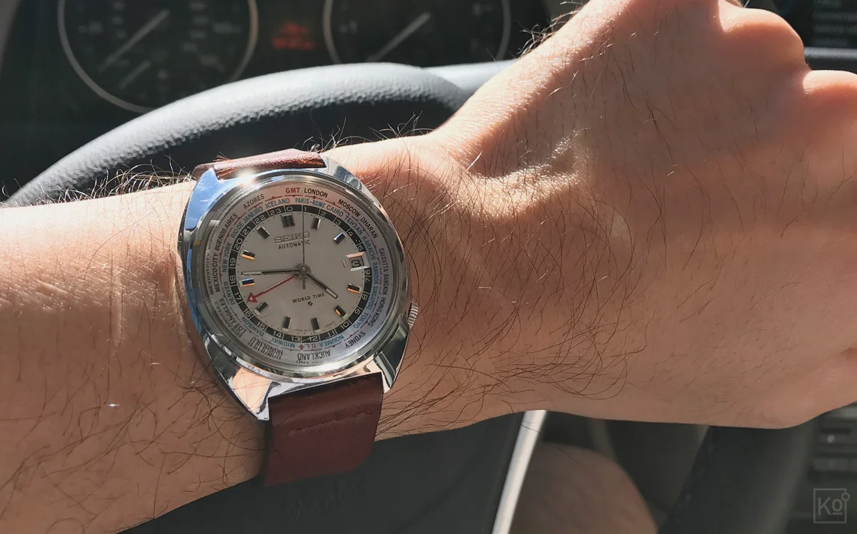
Of the automatic watches I’ve purchased since falling headlong into the world of mechanical watch enthusiasm, this is my favorite: The Seiko 6117-6400 World Time circa 1972 (for the strap junkies in the house, it’s shown here on a dark clay calfskin strap from Hodinkee). I managed to find this gem via a site called Watchuseek, which features an incredibly popular forum for veteran and aspiring watch geeks alike. Rather than going into detail on the 6117-6400 here, I’ll direct anyone who’s interested to an excellent backgrounder published by yet another fantastic site for watch enthusiasts called Analog/Shift. I can’t help but smile every time I look at this beauty—it just makes me feel good, and that’s the real job most anyone buying an analog watch today is hiring it to do.
My pre-mechanical-watch-wearing-self would have pooh-poohed Biver’s sentiment, but the proof is in the wearing. Along those lines, and getting back to the substance of the snippet, I would argue that, today, this job of serving as a deeply symbolic and highly visible totem of one’s values applies not only to $30,000 Swiss timepieces, but to watches at all price points. After all, as the article attests, “nobody needs a watch to know the time,” so whether you’re rocking a utilitarian $200 Seiko SKX007 or an unapologetically OTT $87,500 Ulysse Nardin Freak Cruiser, for the overwhelming majority of contemporary buyers, timekeeping is very much a secondary requirement to self expression. If you need any more evidence to back this up, just ask any watch fan in your life why he or she purchased the piece they’re wearing at that moment, and you’re almost certain to hear some variation of: “It makes me feel good.” In other words, when it comes to watches, it’s less about what it does and more about how it makes you feel.
Talk to fans of smartwatches, on the other hand, and the job they describe is markedly different. I think this is captured well by Jim Dalrymple, a longtime tech writer who wrote one of the most widely shared reviews of the first-generation Apple Watch. Here’s how he opened his review, which was published in June of 2015:
I have been reporting on Apple for more than 20 years now, and in all that time no product has had such an impact on my life as this little piece of hardware and software. I don’t say that for dramatic effect, it has had a profound effect on the way I live.
After a lifetime of not particularly healthy living, Dalrymple was able to shed 40-plus pounds over a matter of months—an accomplishment he attributes in large part to Apple Watch and an associated software platform called HealthKit. As he notes in a follow-up piece, “People have asked if those two Apple technologies have really helped me lose over 40 pounds … I am responsible for losing the weight, but I couldn’t have done it without the information provided by Apple Watch and HealthKit.”
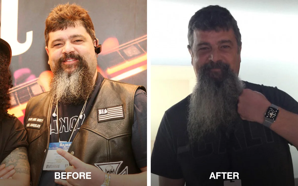
Jim Dalrymple hasn’t shared any before-and-after photos of his Apple Watch and HealthKit-aided transformation, but I was able to pull together this comparison via a photo from before his life change on the left (I wasn’t able to pin down a date, but it’s definitely pre-Apple Watch) and after on the right. As Dalrymple notes in his review of Apple Watch, “People have asked if those two Apple technologies [Apple Watch and HealthKit] have really helped me lose over 40 pounds … I am responsible for losing the weight, but I couldn’t have done it without the information provided by Apple Watch and HealthKit.” (Images via Jim Dalrymple)
And, in case you think this reason for loving Apple Watch applies only to the geeky tech bloggers of the world, I refer you to this more recent review of Apple Watch Series 2 by a very different sort of blogger named Kath, who describes herself as “a Registered Dietician, healthy eater, and mom from Charlottesville, VA”: Why I Love My Apple Watch. Of the eight reasons Kath cites, her top three are rooted in fitness tracking, and all eight involve specific features of the Watch, such as its ability to alert her to notifications received on her smartphone.
Reading positive reviews of Apple Watch like these, a consistent theme that emerges is that the job satisfied buyers have found for the device has little to do with the way it makes them feel as an object, and almost everything to do with its functionality—particularly, its functionality as an activity and fitness tracker. To this point, the closing to Kath’s review is telling—she writes, “…I do hear there are some new generation Fitbits and things that do similar things! Do you have an activity tracker? Love it?” So, even though Kath refers to the device as Apple Watch throughout her review, it’s evident that she views it not as a watch, but as an activity tracker.
In summary, like McDonald’s, which initially assumed that their competitive set for milkshakes was other milkshakes, Apple has conceived Apple Watch around the assumption that their competitive set is other watches. Reading positive reviews like Kath’s and Dalrymple’s—and re-examining my own, more ambivalent experience—it’s clear that this assumption is incorrect.
Why Understanding the Job to Be Done Matters
At this point you might be asking, why does it matter? While I and others who seem to fall squarely into the target audience for the device have found it wanting, clearly, there are people out there who are very happy with Apple Watch. Who cares if the reasons they like it have nothing to do with its “watch-y-ness” and everything to do with its capabilities as an activity tracker?
As a product manager, the reason to care is that this mis-alignment between your job description—aka the brief—and the actual job people out in the real world are hiring your product to do is a red flag signaling missed opportunity. As Christensen noted, his team was able to help McDonalds increase milkshake sales four-fold by simply aligning the brief for the product to its actual job to be done. I believe Apple has a similar sort of opportunity with Apple Watch, but with an exponentially greater potential return—both financially and in terms of societal impact.
The image above shows Apple CEO Tim Cook at the unveiling of Apple Watch Series 2 this past September. It cites data from a third-party research firm indicating that, with only three calendar quarters of sales for Apple Watch in 2015, Apple had already become the world’s second biggest watch seller by revenue. Some pundits interpreted this as a positive and others as a negative, but it certainly reinforces the notion that Cupertino conceived Apple Watch around the assumption that their competitive set was—and still remains—other watchmakers. The problem is, when viewing Apple Watch through the lens of Clayton Christensen’s customer-centered jobs-to-be-done ethos, it becomes evident that buyers aren’t hiring the device for its “watch-y-ness,” but for its capabilities as an activity tracker. For a product manager, this sort of mis-alignment between your job description—aka the brief—and the actual job people out in the real world are hiring your product to do is a red flag signaling missed opportunity. (Image credit: Apple, Inc.)
I wish I could quantify the potential financial upside, but I’d only be guessing. That’s in part because the market for wearable technologies is still nascent, and in part because Apple has never shared concrete sales data for Apple Watch. Those willing to take Apple CEO Tim Cook’s unsubstantiated pronouncements about Apple Watch at face value herald it as a breakthrough success, while others who’ve looked at the fragments of available data have concluded it’s a flop. Even one of the most oft cited Apple Watch proponents, former tech journalist and current venture capitalist M.G. Siegler, is circumspect when it comes to the device’s prospects. Citing estimates as to its first-year sales, Siegler describes Apple Watch as “a pretty great business [that’s] bigger than most businesses,” but acknowledges that “it has to get better than it is now” and suggests that “if the value proposition isn’t consistently raised, this first year of sales may be the equivalent of a movie that opens to huge business, then falls 60% in its second weekend in release, then even more in its third weekend.”
As someone who, like Siegler, wants to see Apple succeed, I agree that Apple Watch must get better than it is now. And, as a product manager who knows that a product is only as good as its brief, I believe that won’t happen until Apple shifts its brief away from making a better watch and towards creating an insanely great activity tracker.
A Thousand No’s for Every Yes
Close observer’s of Apple’s product updates will no doubt be yelling at their screens by now, calling me a numbskull for failing to acknowledge that Apple has already repositioned Apple Watch as a fitness tracker with the introduction of “Series 2” last September. Here’s a snippet from Apple’s press release announcing that update:
Apple Watch Series 2 is packed with incredible fitness and health capabilities including a water resistance 50 meter rating for swimming, and built-in GPS so users can now run without an iPhone.
While these new capabilities may make Apple Watch a more viable option as a fitness tracker for some, the problem with Apple Watch was never a lack of features. Instead, the problem is that it does too many things—starting with trying to be a watch replacement—and these additions do nothing to address that core failing.
This is particularly surprising coming from a company that celebrates its willingness to nix features, and that’s declared on more than one occasion that “there are a thousand ‘no’s’ for every ‘yes’.” That principle seems to apply to the teams working on Mac hardware to a draconian degree, but to the Apple Watch team, not so much.
Okay, so if I were CEO for a day, what would I say no to? I’m glad you asked…
Say NO to being a watch.
I may have beat this point to death already, but I think it’s worth emphasizing because this one decision has enormous downstream repercussions on the form and function of the device. To wit, Apple Watch’s screen mimics the dimensions of an analog watch dial and its case closely aligns to the physical dimensions of modern-day mechanical wristwatches. In addition, just like a conventional timepiece, Apple Watch is fastened to the wrist by way of straps that are not integral to the device itself, but can be interchanged with other straps of varying styles.
But what if Apple didn’t set out to mimic a watch and instead started from a clean slate, knowing that the primary job to be done by the device was to accurately track its wearer’s activity 24 hours a day, 365 days a year? For starters, I believe such a device could do without a screen, instead relaying all data to the wearer’s smartphone and relying on it for any tasks requiring a graphical interface. Eliminating the screen would dramatically reduce the power requirements of our next-gen wearable, enabling Apple to use its battery capacity in other ways—for example, by simply extending battery life or by shrinking its physical dimensions.
Speaking of shrinking, forgoing the screen, as well as the dimensional and fastening conventions of a wristwatch, would also free Apple’s designers to pursue a more diminutive form factor that could be worn alongside a conventional timepiece rather than forcing prospective buyers into an either-or decision. If this idea of wearing a watch on one wrist and an activity tracker on the other sounds outlandish to you, take a few minutes to observe people’s wrists the next time you travel through a major airport—I think you’ll be surprised by how many folks are already doing this, not to mention the even larger population who wear a watch on one wrist and some manner of prominent bracelet or bangle on the other. In short, this doesn’t need to be the zero sum game between watch and activity tracker that Apple’s made it out to be.
Finally, by eliminating the screen and its associated touch interface—which would in turn significantly reduce the compute and energy requirements of the device—Apple could also significantly reduce its price. This is important because of the obvious association between price and demand, but, more critically, because a lower price would bring the device and its benefits within reach of more people. In fact, none other than Apple CEO Tim Cook has made the argument for getting the price of Apple Watch down to a more accessible level: While discussing the Watch and HealthKit during an interview at Startup Fest Europe last May, Cook declared that “we believe that health is something that is a huge problem in the world—a huge issue—and we think it is ripe for simplicity and sort of a new view, and we’d like to contribute to that.”
Yes, Apple has already reduced the price of its base Watch model to $269, but to truly have an impact on health around the world—and not just in the wealthy nations of the world—the Watch needs to get down to a sub-$100 price point as soon as possible.
These might sound like impossible requirements, but it turns out that Apple has been shipping a device designed around a very similar set of constraints for over a decade: The iPod Shuffle. When it was introduced way back in 2005, the screen-less, single-purpose, plastic-bodied Shuffle with 1GB of storage retailed for $149 USD. That dropped to $99 by 2006 and, today, you can purchase a new 2GB iPod Shuffle from Apple for $49. So, with a focused brief, Apple can absolutely deliver a simple, highly desirable and highly accessible product for the masses. These values need to become priorities for the device currently known as Apple Watch.
Say NO to non-essential features.
This is closely related to the point above regarding price point accessibility, but I believe eliminating non-essential features will not only make our next-gen wearable cheaper, it’ll make it better.
What features would I eliminate? Basically, anything that doesn’t contribute to making the device an insanely great activity tracker. So, out would go the ability to run apps on the device (since it wouldn’t have a screen, the concept of on-device apps would be moot anyway); the ability to play music from the device; the ability to store or view photos on the device; the ability to initiate or receive phone calls or messages via the device; and the ability to use the device to make contact-less payments. Some of these features are cool, but they all detract from the core job-to-be-done by adding cost, complexity or a combination of the two, and they can all be done more effectively via a smartphone.
Because the ability to track strain and recovery across the entirety of a wearer’s life—day and night—is a key element of WHOOP’s value proposition, the company had to come up with a way to enable charging of their WHOOP Strap while it was being worn. The solution they devised is quite clever: Rather than charge the Strap directly, users charge an external battery pack that can stay plugged into your nightstand while you’re away from home. At night, when the pack is fully charged, you unplug it from the outlet and slide it directly onto your WHOOP Strap, enabling you to charge the Strap without ever taking it off. This is somewhat similar to the charging mechanism Apple developed for their AirPods wireless headphones—like the WHOOP Strap, they aren’t charged directly but via a charging case. Of course, truly wireless charging over a distance would offer the greatest convenience, but WHOOP’s concept is a good intermediate approach that Apple should consider for a next-gen activity-tracker. (Image credit: WHOOP)
With those non-essentials out of the way, I’d have the product team focus all of its energies on five key priorities: Making the device small and comfortable enough to be worn 24 hours a day, 365 days a year; enabling it to be charged while it’s being worn (see the WHOOP Strap for one way to do this); making the device the most capable and accurate in the industry at sensing and tracking the physiological signals associated with health and wellness over time; developing a dead simple haptic “interface” for interaction with the device; and getting its price to no more than $149 USD at launch, and to less than $100 USD within three years of launch.
Say NO to iPhone exclusivity.
This one is simple: If Tim Cook means it when he says “health is something that is a huge problem in the world” and that he’d like to see Apple contribute to solving the problem, Apple’s activity tracker must work with Android devices, which comprised 81.7% of global smartphone sales in the fourth quarter of 2016.
While some may see this as a capitulation, I see tremendous upside for Apple in this shift. Much in the way that iPod served as a Trojan Horse into the Wintel hegemony, helping Apple win back PC market share through the 2000s, our re-imagined activity tracker would introduce the benefits of Apple’s ecosystem to a generation that’s grown up with Android, creating an opportunity to spur iPhone sales.
For this to Trojan Horse to have any kick, however, Apple needs to do one more thing...
Say YES to a renewed commitment to software.
One thing shared between Jim Dalrymple’s glowing review of Apple Watch and Tim Cook’s commentary on the device from Startup Fest Europe is that they both mentioned a software platform called HealthKit.
HealthKit isn’t an app, but a framework created by Apple that developers can use to store activity and fitness data captured by their apps. This structured, secure and centralized repository enables health and fitness apps to share data with each other, while offering end-users visibility and control over that inter-app sharing. As end-users, we don’t directly interact with HealthKit—instead, for the vast majority of iPhone users, our window into that data is the Health app that comes bundled with iOS. And herein lies the problem, because the Health app is, in a literal sense, dumb.
Here’s what Apple’s Health app looked like in its first incarnation: It offered an interface only an actuary could love. Unfortunately, while the app’s front-end has become friendlier, it remains little more than a dashboard for information that, on its own, is of almost no value. To unlock the sort of world-changing potential that Tim Cook talks about, Health must evolve from a dumb data repository to a smart, individually tailored health advisor. While that’s no easy task, Apple is among the few companies with the engineering chops and appreciation for human behavior necessary to deliver on this vision—but it’s going to take a much bigger commitment to software and artificial intelligence in the health space. (Image credit: Apple, Inc.)
I should note that it has at least improved aesthetically since the version Dalrymple used while reviewing Apple Watch back in 2015. In my experience, that first iteration of the app offered a UI that only an actuary could love. Its interface is friendlier now, but its fundamental failing has not been addressed, which is that the Health app remains a dumb data repository rather than a source of health insights. To explain what I mean here, let me once again quote from Dalrymple’s review of Apple Watch:
I started using HealthKit every day to see how different things would affect my weight loss and generally how I felt. Did I lose more weight walking in the morning or the afternoon? What foods made me gain weight? Should I skip meals and hope that helps with weight loss? I hesitate to say I became obsessed, but I did become more aware of what I did and how it affected me, both physically and mentally.
As noted earlier, with the help of Apple Watch and HealthKit, Dalrymple lost 42.4 pounds over the course of 10 months. This is a textbook example of the potential for technology to improve health in deeply meaningful ways. But here’s the key: Dalrymple understood that he had to connect the dots between his behavior, the data captured by his Apple Watch and the outcomes he was experiencing. As cited above, he kept track of things like whether he lost more weight by walking in the morning or the afternoon and, generally speaking, became more aware of how physical activity influenced him, “both physically and mentally.”
Dalrymple was sufficiently motivated to keep track of all of these associations manually, which is fortunate because Apple’s Health app offers no help in this department. In its current incarnation, it’s little more than a dashboard that displays information that, on its own, is of almost no value. What if, instead of being a dumb repository, Health became a smart advisor? So, in Dalrymple’s scenario, it could have connected the dots on his behalf and advised that, for him, morning walks appear to contribute to greater weight loss than afternoon walks. I’m not privy to Dalrymple’s activity and fitness data so that’s a hypothetical example, but hopefully you get my drift.
Here’s another example, in this case from my own review of Apple Watch:
I’ve also found that my Watch can give me advance warning of illness. On two occasions, I noticed that my heart rate was roughly five beats-per-minute higher than it would normally be during a given activity. I wasn’t exhibiting any outward signs of sickness at the time of these measurements, but, on both occasions, I began to show typical cold symptoms within a couple of days.
I was only aware of this because I’m a data geek and was keeping track of changes in my heart rate over time. Imagine how useful the Health app could be to the non-data geeks of the world if it could pro-actively share insights like these. For example, the app could have told me that I’m exhibiting early signs of a cold and pointed me to a credible reference on effective interventions, thereby helping me to moderate the severity or duration of my symptoms.
Shown here is the Today screen as it appears now in iOS 10. This currently under-utilized real estate would be a great place to surface contextual recommendations related to your health and fitness. (Image credit: iDownloadBlog.com)
Along these lines, the “Today” screen of iOS, which currently displays things like the weather, upcoming calendar events and news stories that Apple thinks I might be interested in, should be updated to include individually tailored suggestions related to health and fitness. For example, based on data from my next-gen Apple wearable—which I’d be able to wear while sleeping to track sleep quality—combined with my health history and my calendar, my phone might advise me to switch my run to the morning instead of my typical afternoon slot in order to maximize productivity for the day.
Here’s another scenario that would help improve my life: Knowing, based on my calendar or the travel itineraries I’ve received via email, that I have a trip to Japan coming up in two weeks, the Health app could offer me a revised sleep schedule that incrementally acclimatizes me to that new time zone. This wouldn’t be a cookie-cutter plan—instead, it would be tailored specifically to my needs based on my historical sleep and health data. If I were to accept the suggestion, the phone would automatically edit my “do not disturb” and alarm settings, eliminating the need for any manual interventions on my part. The net result would be a dramatic reduction in my jet lag while on the ground in Japan, enabling a much more productive and enjoyable trip.
The bottom line here is that hardware is only one piece of the puzzle. Whereas Apple currently appears to be devoting about 80% of their efforts in the health space towards hardware and 20% towards software (and that’s a generous assessment), I believe that split needs to be closer to 50/50 in order to unlock the sort of world-changing potential that Tim Cook talks about.
Conclusion
Wow, if you’ve made it this far, I’m impressed—thanks for sticking with me! If you’re wondering why in the world I put so much energy into a piece that has a snowball’s chance in hell of getting in front of anyone at Apple who might actually read it and be in a position to effect change, it’s because I agree with Tim Cook that health is a critical global issue and that Apple is uniquely positioned to make a meaningful dent in the problem.
A landmark 2005 report published in the New England Journal of Medicine found that “After remaining relatively stable in the 1960s and 1970s, the prevalence of obesity among adults in the United States increased by approximately 50 percent per decade throughout the 1980s and 1990s,” such that “Two thirds of adults in the United States today are obese or overweight.” In an interview with the NY Times, one of the report’s authors spoke to the potential consequences:
“Obesity is such that this generation of children could be the first basically in the history of the United States to live less healthful and shorter lives than their parents,” said Dr. David S. Ludwig, director of the obesity program at Children’s Hospital Boston, and one of the authors of the report … “We’re in the quiet before the storm,” Dr. Ludwig said. “It’s like what happens if suddenly a massive number of young children started chain smoking. At first you wouldn’t see much public health impact.” He added, “But years later it would translate into emphysema, heart disease and cancer.”
Aside from the negative impacts on the well-being of affected individuals and their loved ones, obesity is also hurting the U.S. economy, according to a 2015 report from Bloomberg Businessweek. The magazine cites research from Cornell University economics professor John Cawley, indicating that “obesity raised medical-care costs by $315.8 billion in 2010,” an inflation adjusted increase of 48 percent compared to 2005. And, lest you think that burden falls only on those who are obese, according to Cawley, “the costs are usually paid by private and public health insurance, meaning that leaner people are subsidizing those with less healthy diets.” In other words, “All of us are paying these costs."
And while this crisis is particularly acute in the West in general and the United States in particular, it is increasingly a global issue. According to the World Health Organization, “worldwide obesity has more than doubled since 1980” and, today, “overweight and obesity are linked to more deaths worldwide than underweight.”
The maddening thing about this is that, as the WHO rather dryly notes, “Overweight and obesity, as well as their related noncommunicable diseases, are largely preventable.” I don’t believe that wearable, activity tracking tech is the panacea for this pandemic, but I’ve read and heard enough accounts like Dalrymple’s to be convinced that it can be a significant part of the solution.
Speaking of solutions, the WHO’s recommendation to governments is quite simple: “make regular physical activity and healthier dietary choices available, affordable and easily accessible to everyone, particularly to the poorest individuals.” To me, this should become the mantra adopted by the Apple Watch team: Stop trying to make a next-generation watch, and focus instead on creating a next-generation activity tracker—Health app included—that’s “available, affordable and easily accessible to everyone,” and doesn’t just surface data but provides ongoing, individually tailored coaching that helps its users lead healthier, more productive lives.
Various companies have the chops to tackle parts of this enigma, which is equal parts tech and human behavior. Google comes to mind most immediately given their deep capabilities in cloud services and artificial intelligence, as does Facebook for their expertise in social influence, but I believe only Apple has the blend of engineering prowess and appreciation for the humanities—the intersection of technology and the liberal arts that Steve Jobs often emphasized—necessary to pull this off at scale. To do so, however, the company will need to “think different” about their approach to Apple Watch. For all our sakes, here’s to hoping they find the courage to start fresh and truly confront the most significant global health challenge of our time.
Agree? Disagree? Have questions? Let’s continue the conversation on Twitter @edotkim.

